Viewports & breakpoints
A viewport is one screen width on the canvas. All your viewports sit side by side, so you see every breakpoint at once.
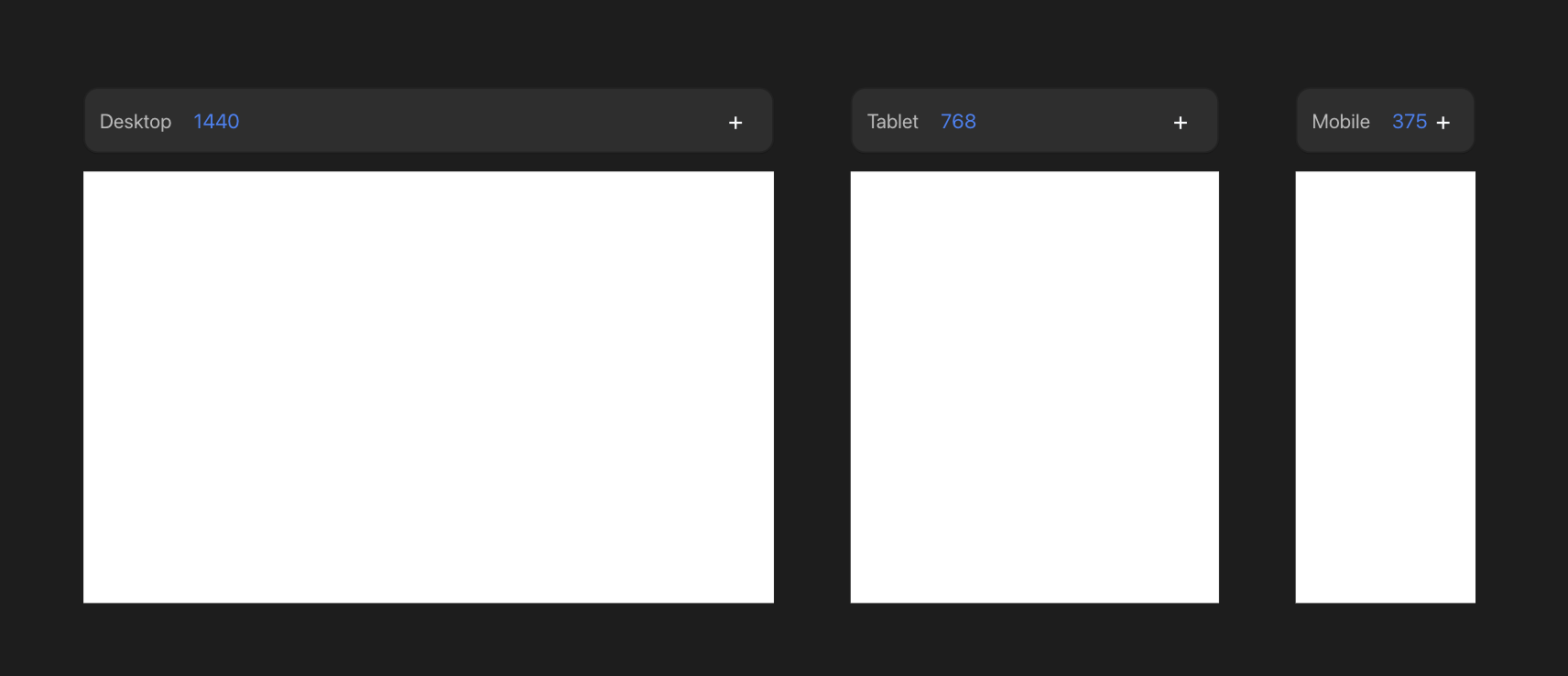
The primary viewport
A new project starts with one viewport: Desktop, at 1440px. It's the primary viewport — its styles are the base for every breakpoint you add later.
Add as many more as you need. Common widths to design for:
| Viewport | Width |
|---|---|
| Desktop | 1440px |
| Tablet | 768px |
| Mobile | 375px |
Every viewport beyond the primary is a replica. It shows the merged result of the base plus any overrides.
Add a viewport
- Press + on a viewport to add a new breakpoint next to it.
- There is no limit — add a breakpoint for any width you want to design for.
Edit a viewport
- Click into a viewport to edit it.
- Edits on the primary viewport change the base, so they flow to the others.
- Edits on any other viewport become per-viewport overrides. See Per-viewport overrides.
Change a breakpoint width
A viewport's width is its breakpoint value — the screen width at which its styles take over on the live site. Change it two ways:
- Drag the viewport's resize handle.
- Or select the viewport and set its width in the Dimensions tool.