Overlays & popovers
An overlay is a floating panel that opens from a trigger element. Use overlays for menus, dropdowns, modals, and tooltips. There are two kinds: relative and fixed.
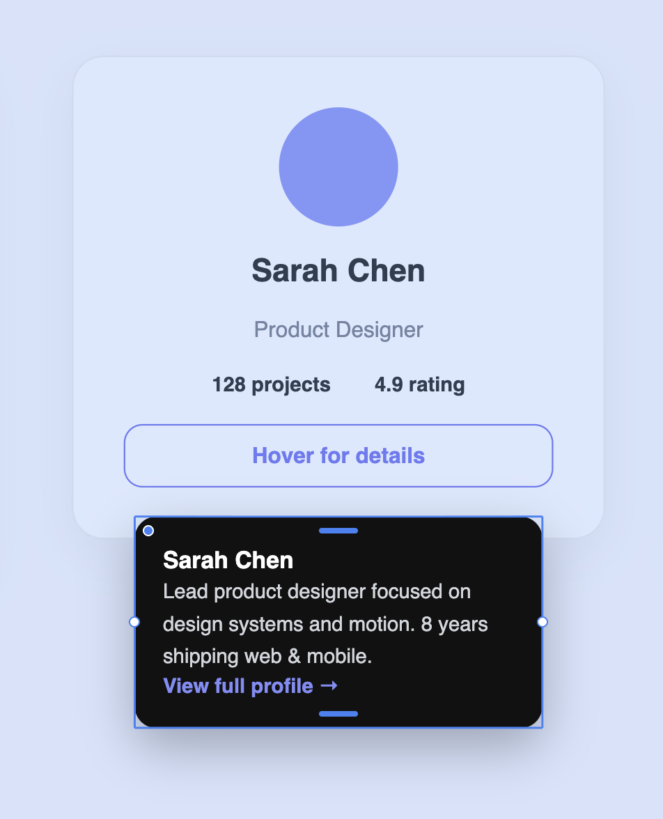
Relative overlays
A relative overlay is anchored to its trigger. It opens on a side of that element — below, above, left, or right — and follows it. Use relative overlays for menus, dropdowns, and tooltips that belong to a specific button or card.
Fixed overlays
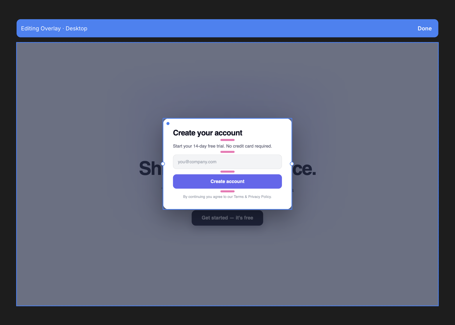
A fixed overlay floats over the whole page instead of anchoring to its trigger — it sits centered on screen and dims everything behind it. Use fixed overlays for modals and dialogs, like a sign-up form or a confirmation prompt.
Creating an overlay
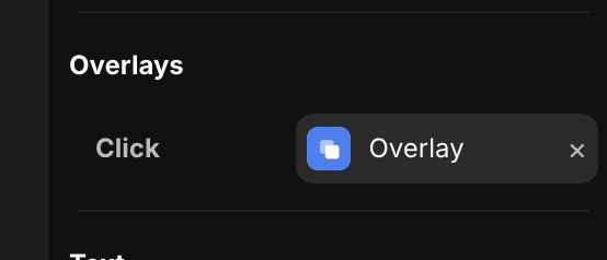
Select the element you want to be the trigger, open the Overlays section in the right panel, and add an overlay. You can make it relative or fixed. The overlay's content is a frame you design like anything else — double-click it to enter overlay edit mode and build it out.
Overlay settings
Select the overlay to open the Overlay tool in the right panel. It controls how the overlay opens and where it sits.
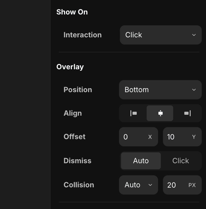
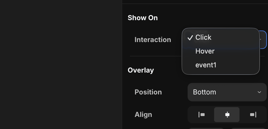
- Interaction — what opens the overlay: Click, Hover, or a custom event exposed from a component (see below).
- Position — which side of the trigger the panel opens on: Bottom, Top, Left, or Right. (Relative overlays only — fixed overlays are centered.)
- Align — how the panel aligns along that side: start, center, or end.
- Offset — nudges the panel away from its anchor. X shifts it sideways, Y shifts it along the open direction (e.g.
10Y leaves a 10px gap below the trigger). - Dismiss — how the overlay closes:
- Auto — it closes on its own when you move away or interact elsewhere.
- Click — it stays open until the user explicitly dismisses it.
- Collision — keeps the panel on screen. Auto flips or shifts it when it would run off the edge, and the px value is the minimum gap it keeps from the viewport edge.
Triggering a fixed overlay from a component
Sometimes the element that should open an overlay lives inside a component instance — for example a "Get Started" button component dropped on the page. To open an overlay from there, expose an event from the component.
Go inside the component, add an Interaction with an Event type, and create the event variable (here, event1).
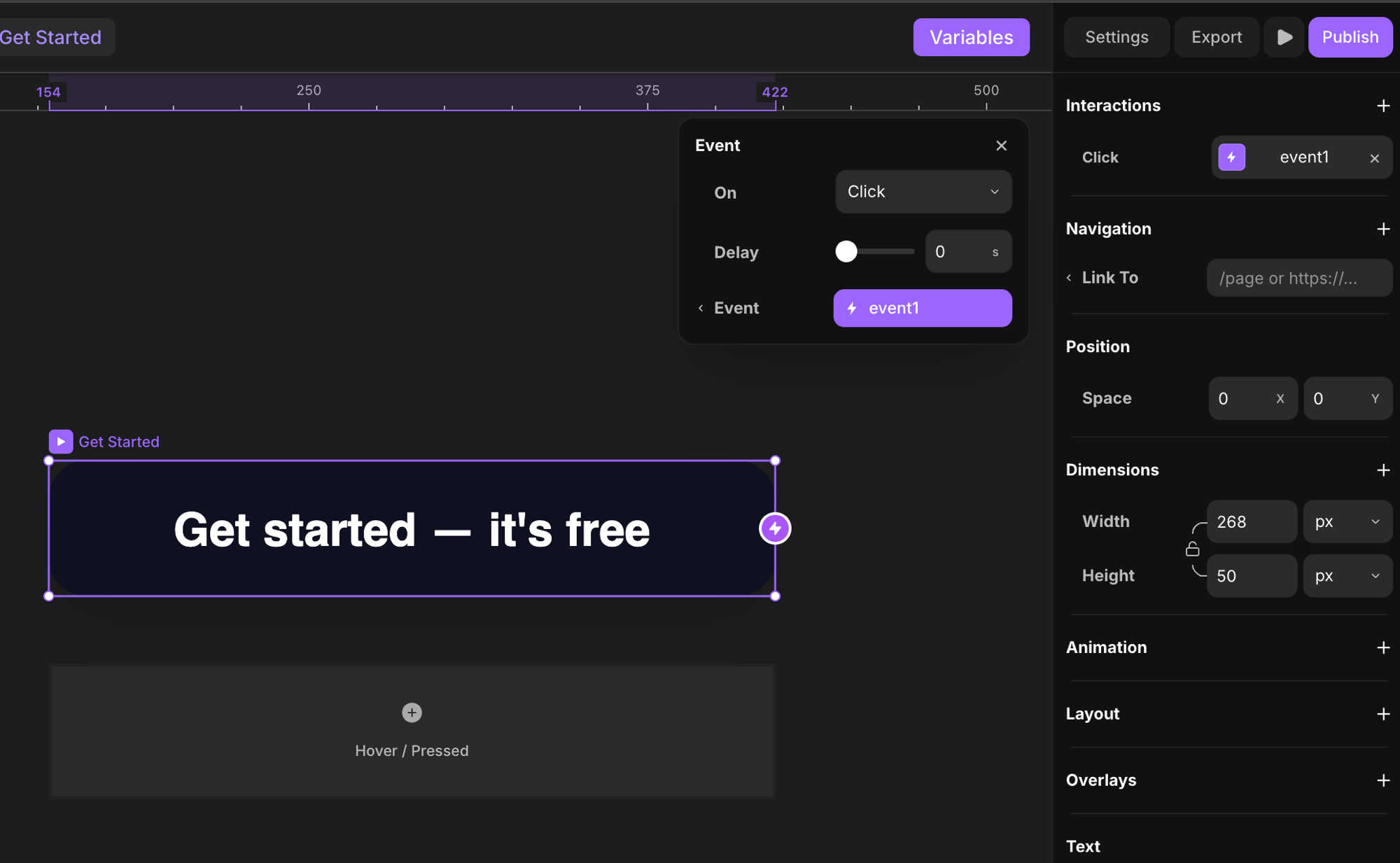
Back on the page, select the overlay's trigger and open the Interaction dropdown — the component's event now appears in the list alongside Click and Hover. Pick it to open the overlay when that event fires.
This is especially useful for fixed overlays you want to trigger from elements inside component instances — like opening a sign-up modal from a reusable button component.
Set a variant when the overlay opens
When you put an overlay on a component instance, you can also pick the variant the instance animates to when the overlay opens. Use the On Open → Set Variant option in the Overlays section to choose the variant.
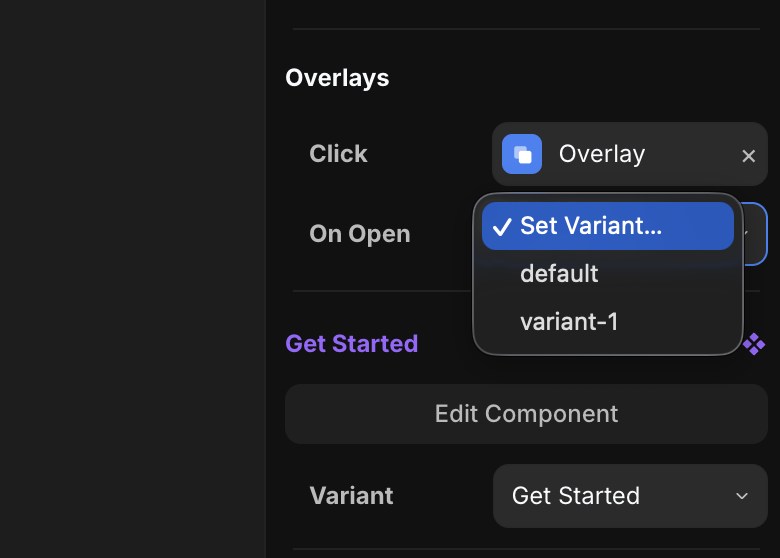
So opening the overlay and switching the trigger's state happen together — for example, the button animates to its pressed variant the moment its modal appears.
Uses
- Menus.
- Dropdowns.
- Modals.
- Tooltips.