Design components
A component is a reusable piece of design. Make it once, drop instances anywhere, and edit the master to update them all.
Make a component
Right-click an element (or a selection) and choose Make Component. You can also create one from the Library panel with the +.
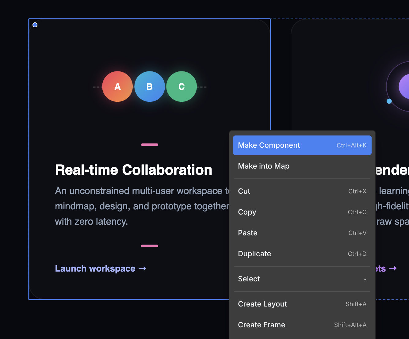
It replaces your selection with an instance of the new component.
Add more instances
Open the Library panel and drag the component onto the canvas. Each drag creates a new instance.
Edit the master
Editing the master updates every instance. There are three ways to open it:
- Double-click an instance on the canvas to enter its master.
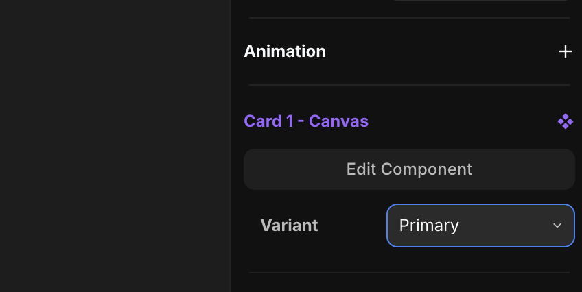
- Click Edit Component in the component tool in the right panel.
- Click the component in the Library panel.
Variants
A variant is a visual state of a component — Primary, Hover, Open, anything you name. Switch between them with the Variant selector in the component tool.
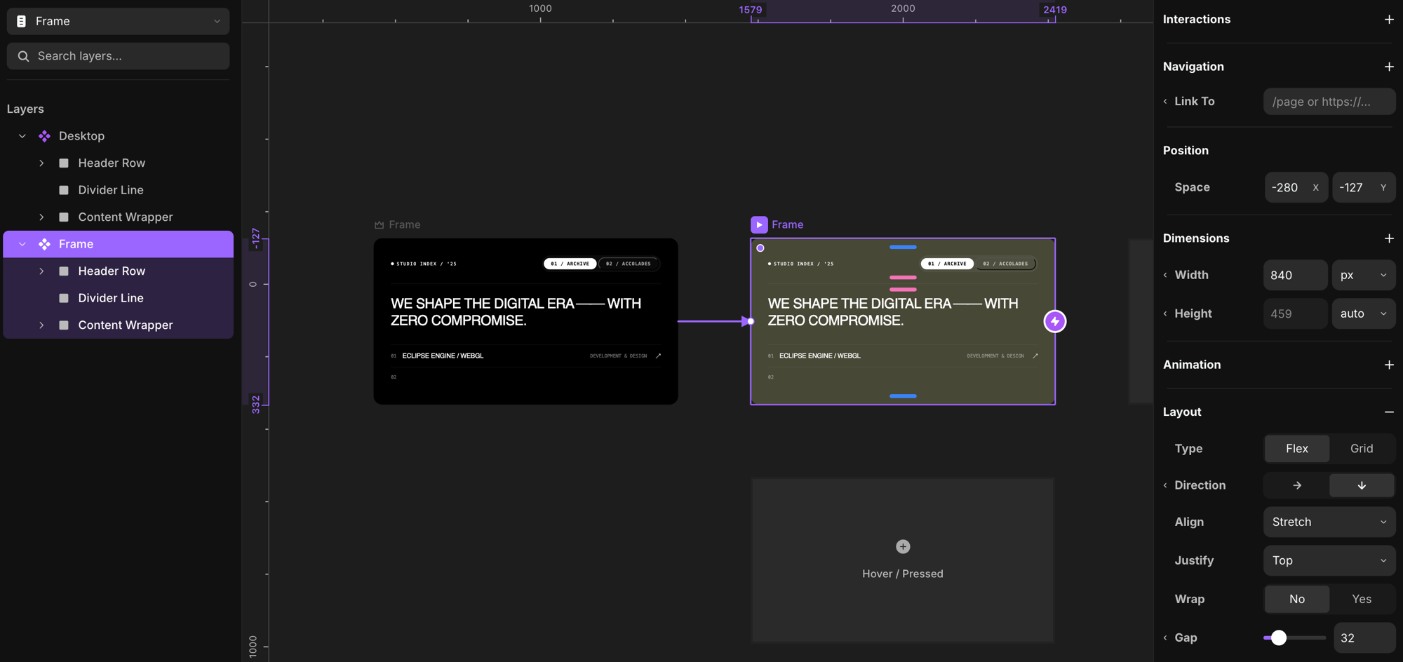
Inside the master, each variant sits side by side. Two add buttons let you grow the component:
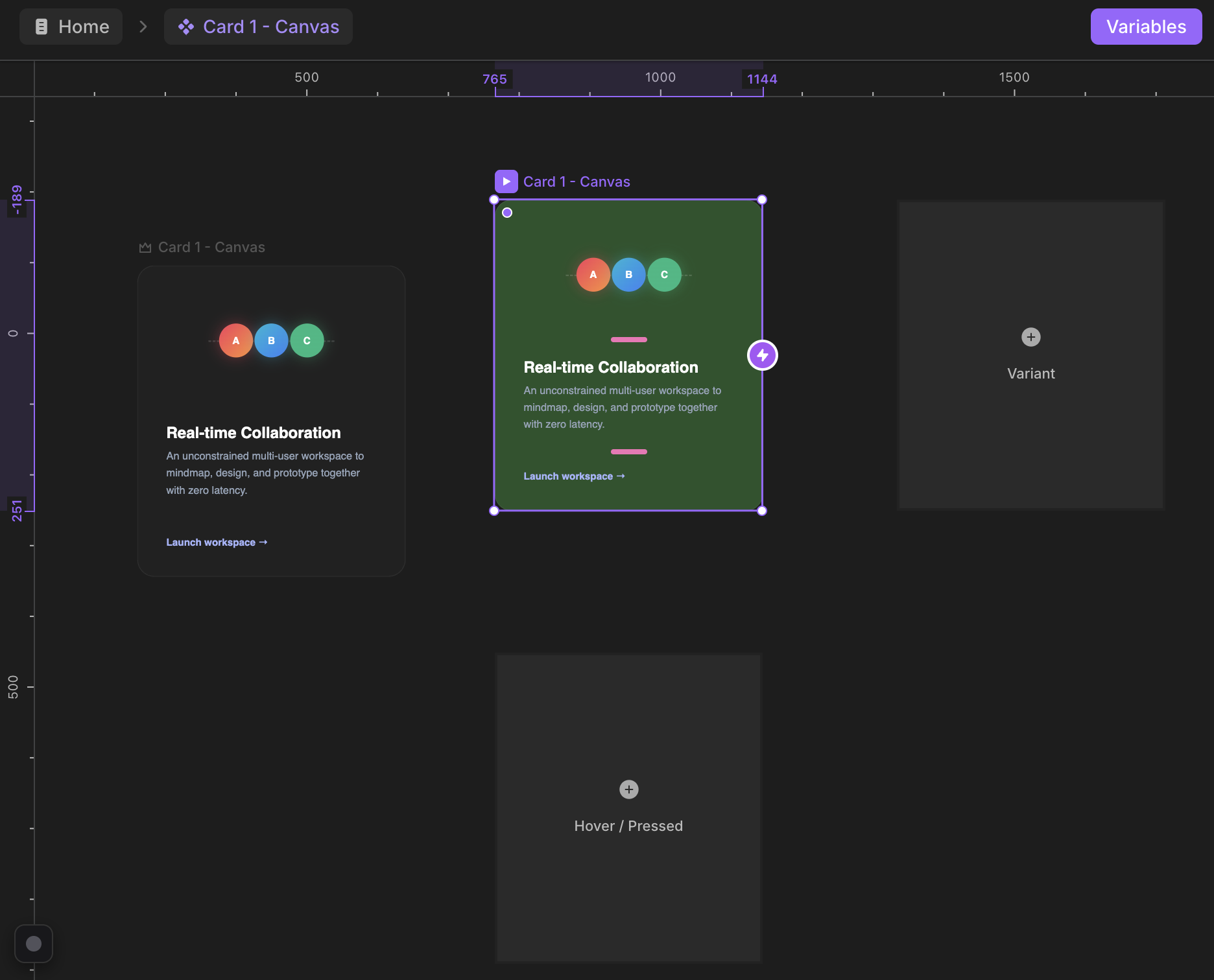
- Variant — adds a new variant. It starts as a mirror of the variant you add it from, so that source variant is its source of truth. Restyle the new one from there.
- Hover / Pressed — adds a hover or pressed state and automatically wires a connection to it. The connection belongs to that one source variant only.
Make variants interactive
Drag the ⚡ handle on a variant to another variant to connect them, then choose the Connection Type — the trigger and an optional delay — and hit Create Connection.
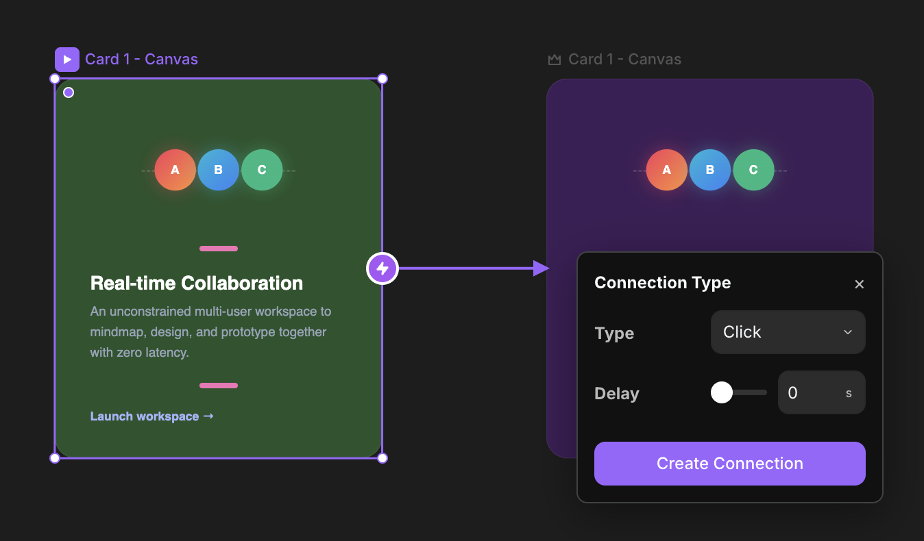
The component transitions between the two states when the trigger fires:
| Trigger | Fires when |
|---|---|
| Click | the element is clicked |
| Mouse enter | the pointer moves over it |
| Mouse leave | the pointer moves off it |
| Press | the element is pressed and held |
| In view | the element scrolls into view |
Create as many variants as you like — there's no limit. Build different states of your elements and animate between them infinitely.
Variables
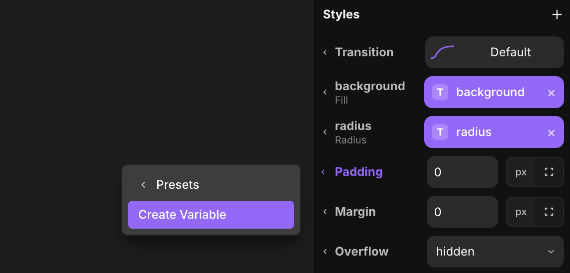
Almost any property in the properties panel — inside a design component — can be turned into a variable. Variables let you change those values per instance when you drop the component elsewhere.
Right-click a control's label and choose Create Variable. The property becomes a named variable, shown as a purple pill.
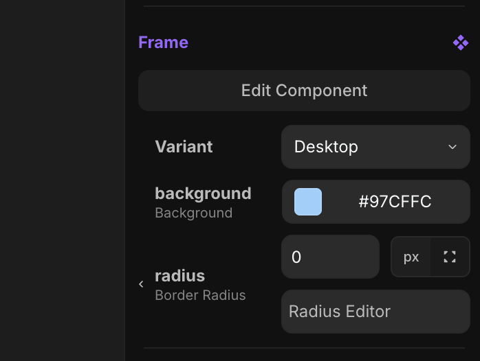
Once a property is a variable, select any instance of that component and you'll find the variable in the component tool — edit it there, per instance.
Hoisting
When you nest a component instance inside another component, and that nested instance has variables, you can hoist a variable one level up — so the parent component controls the nested instance's value. Nesting and hoisting go infinitely deep.
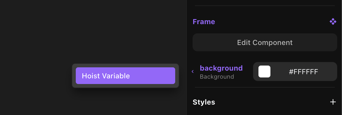
You can also hoist the variant selection of a nested instance, so a component higher up the hierarchy decides which variant the nested instance shows.
Transition
A transition controls how a component animates from one state to the next. Open the Transition Settings on a connection.
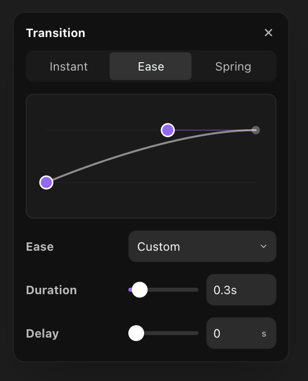
Pick a Type:
- Instant — no animation. The change happens immediately.
- Ease — a time-based curve. Choose the Ease (Ease Out, Ease In, Ease In Out, Linear, Back, Circ, Anticipate, or a custom bezier) and a Duration.
- Spring — natural, bouncy motion. Choose what it's based on:
- Time — set a Duration and a Bounce (how much it overshoots).
- Physics — set Stiffness (how strong the spring pulls), Damping (how quickly it settles), and Mass (heavier moves slower).
Ease and Spring also take a Delay before they start.
Detach
Detach an instance to convert it back into plain inline elements. The link to the master is removed, so future master edits no longer reach it.