Layout, Position & Size
A layout frame arranges its children automatically — rows, columns, and grids. Position controls where a single element sits, and Size sets how wide and tall it is.
Create a layout
Two ways:
- Select elements and press ⇧A to wrap them in a layout frame.
- Select a frame, then set Layout in the right panel.
Remove a layout
Press the − on the Layout panel header to remove the layout. Every child becomes absolutely positioned, so the frame turns into a free drag area where you can place elements anywhere.
Flex
Flex lays children out in one direction.
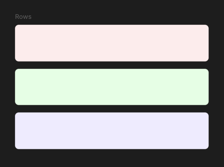
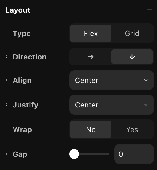
- Direction — lay children out in a row or a column.
- Align — position children on the cross axis (start, center, end, stretch).
- Justify — position children on the main axis (start, center, end, space-between).
- Wrap — let children flow onto the next line when they run out of room.
- Gap — space between children.
Grid
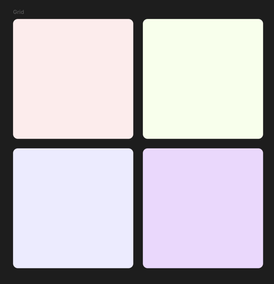
Grid places children on rows and columns.
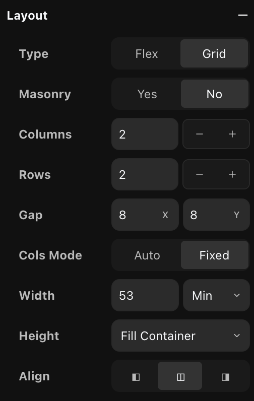
- Masonry — pack items into columns by height, Pinterest-style, instead of a strict grid. Turning it on hides the row, height, and column-mode controls.
- Columns / Rows — how many column and row tracks the grid has.
- Gap — spacing between cells. X is between columns, Y between rows.
- Cols mode — Fixed uses exactly the Columns count. Auto fits as many columns as the width allows and wraps the rest.
- Width — the width of each column. Min lets columns grow to fill the space but never shrink below this value. Fixed pins them to an exact width.
- Height — the height of each row. Fill container shares the parent's height across the rows, Fixed sets an exact height, Fit content lets each row size to its content.
- Align — when the grid is narrower than its container, align it to the left, center, or right.
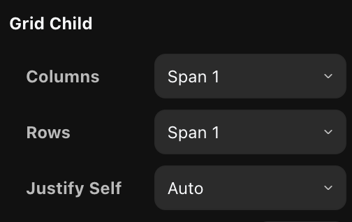
Grid child
Select a child inside a grid to override how it sits:
- Columns / Rows — span the child across more than one column or row.
- Justify self — break from the grid's alignment for this one child.
Position
The Position section controls where an element sits and how it holds its place when its parent resizes.
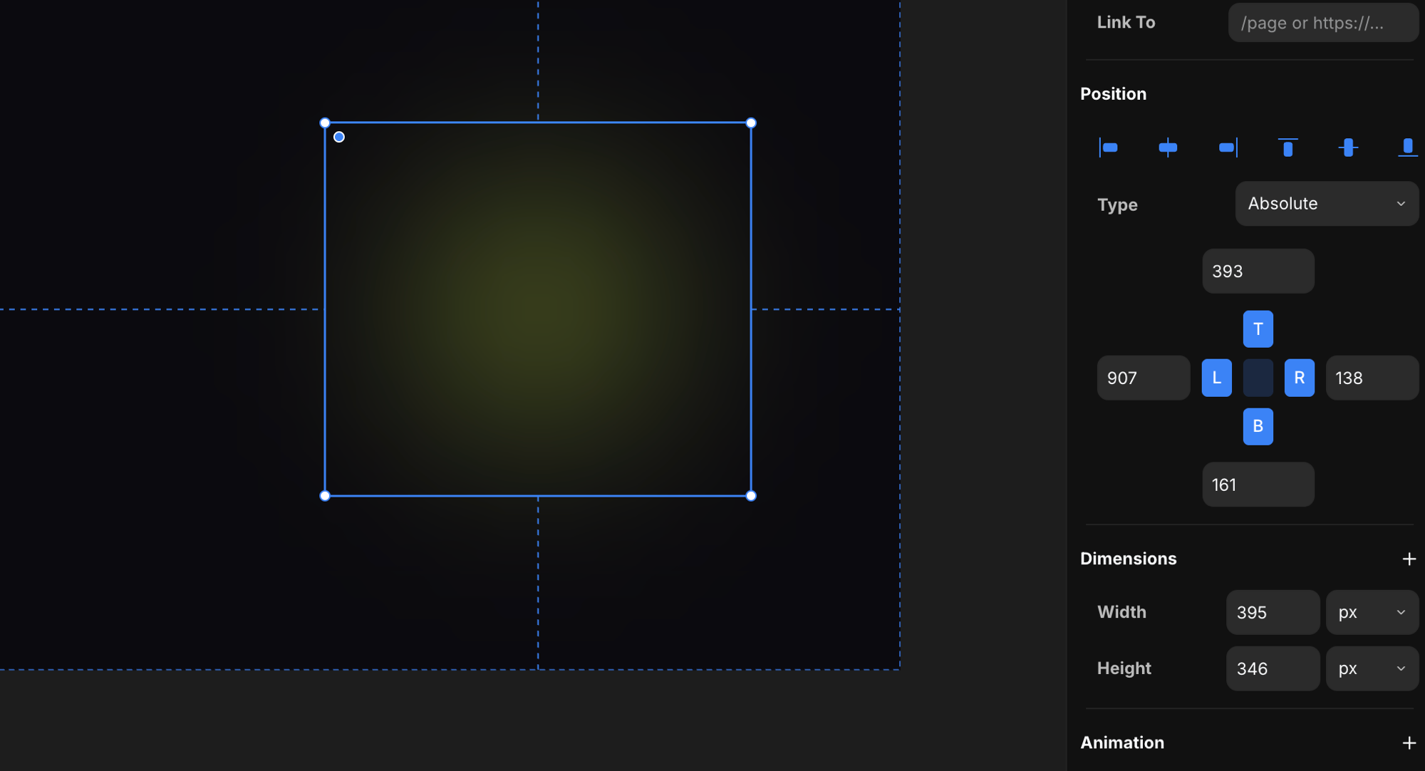
Type
Set how the element is positioned. Switching types keeps the element exactly where it looks, so it never jumps.
- Relative — the element flows with its siblings, and you can nudge it with an offset. Siblings still reserve its original space.
- Absolute — lifts the element out of the flow and positions it inside the nearest positioned parent. This is where pinning turns on.
- Fixed — positions against the screen and stays put while the page scrolls.
- Sticky — flows with the page until it reaches the Top offset you set, then stays pinned there while the rest of the content scrolls past. It only sticks within its parent, so it lets go once the parent scrolls out of view. Pick Sticky and a Top field appears — set the distance from the top at which it should stick.
Heads up: sticky needs a scrollable ancestor with visible overflow. If any parent has its overflow set to
hidden,scroll, orauto, the element won't stick.
Pinning
When an element is absolute or fixed, the cross of inputs pins it to its parent's edges. The letters — T top, B bottom, L left, R right — toggle each edge on or off (blue = pinned). The number next to a pinned edge is its distance from that edge.
- Pin one edge — the element keeps a fixed distance from that edge and a fixed width or height. Pin L and it holds to the left; pin R and it holds to the right.
- Pin both opposite edges — pin L and R (or T and B) and the element stretches between them. It drops its fixed width (or height) and resizes with the parent.
- Unpin an edge — release it and the element centers itself, holding its visual position.
- Pin all four — use the center button to pin every edge at once. The element drops both its fixed width and height and sizes itself from the four insets, so it tracks the parent's width and height — grow the parent and the element grows with it, leaving the same gap on every side.
This is how you make an element stay glued to a corner, hug one side, or stretch full-width as the viewport changes.
Aligning
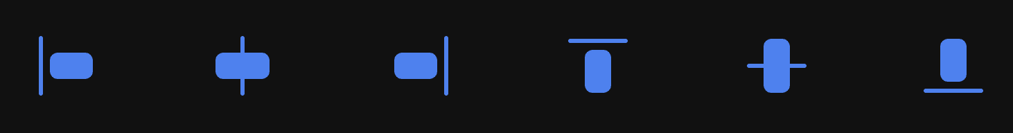
The row of buttons at the top of the Position section aligns the element inside its parent — left, center, or right across, and top, middle, or bottom down. They work on absolute and fixed elements.
Select more than one element and the same buttons align them to each other, using the selection's bounds — line up their left edges, center them on a shared axis, and so on.
Size
The Dimensions section sets an element's width and height.
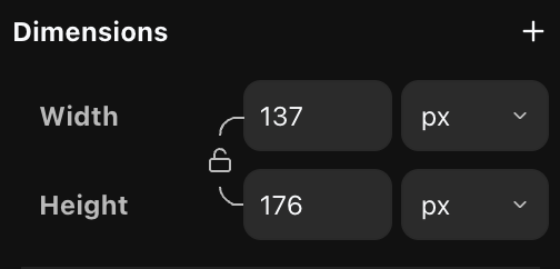
Type a value into Width or Height and pick a unit:
- px — an exact pixel size.
- % — a percentage of the parent.
- auto — size to the content.
- vw / vh — a percentage of the viewport width or height. These resolve per viewport, so the same value reads differently on each breakpoint.
The lock between width and height keeps their aspect ratio — change one and the other scales to match.