Dimensions
Control the size of your elements with different dimension units.
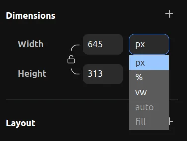
Dimension Units
PX — Fixed pixel value. The element will always be exactly this size.
% — Percentage relative to the parent element. For example, 50% width means half the width of the parent.
VW — Viewport width. 100vw is the full width of the browser window. Useful for full-width sections.
VH — Viewport height. 100vh is the full height of the browser window. Useful for full-screen sections.
AUTO — Fit to content. The element will size itself based on its contents. This is equivalent to width: auto or height: auto in CSS.
FILL — The element will fill the available space. This uses fractional units (fr). For example:
1fris equivalent toflex: 1 0 0pxin CSS2fris equivalent toflex: 2 0 0pxin CSS- If you have two elements side by side both set to
1fr, they will share the space equally. If one is2frand the other is1fr, the first will take twice as much space.
Important: AUTO on Component Instances
For Component Instances, AUTO works differently. Instead of fitting to content, it will resolve to the dimensions of its master variant.
For example, if a master variant has 300px height, and you set AUTO on a component instance of this variant, it will resolve to 300px.
If your master variant has AUTO width or height, then AUTO on the instance will also resolve to AUTO, fitting to the content inside.
Aspect Ratio
You can lock the aspect ratio of an element to maintain proportions when resizing.
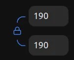
When the aspect ratio is locked, resizing one side will automatically adjust the other side to maintain the same proportions.
Minimum/Maximum Dimensions
You can set minimum and maximum constraints for width and height.
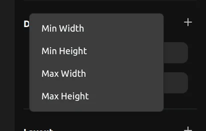
Click the + button on the dimensions section to add min-width, max-width, min-height, or max-height constraints. This prevents elements from becoming too small or too large.