Positioning
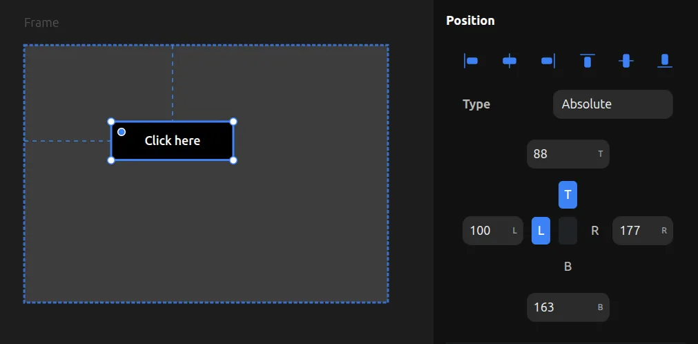
Absolute Position
Elements can be positioned freely when set to position: absolute. You can drag them anywhere within their parent frame.
If a parent frame has no layout (no Flex or Grid), child elements are automatically always absolute.
You can also make elements absolute inside a Flex or Grid parent by changing their position from relative to absolute. This takes them out of the layout flow, allowing them to be positioned freely while other children remain in the layout.
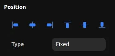
Fixed Position
Fixed elements stay in the same position on screen even when scrolling, just like position: fixed in CSS.
Fixed position can only be set when an element is a direct child of a viewport (Desktop, Tablet, or Mobile). Fixed elements are useful for sticky headers, floating buttons, or any UI that should remain visible while scrolling.
Position Pinning
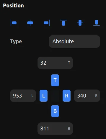
Position pinning controls how an element is anchored to its parent's edges. Each side (Left, Top, Right, Bottom) can be pinned independently.
How Pins Work
- Left pin — Sets the CSS
leftproperty (distance from parent's left edge) - Top pin — Sets the CSS
topproperty (distance from parent's top edge) - Right pin — Sets the CSS
rightproperty (distance from parent's right edge) - Bottom pin — Sets the CSS
bottomproperty (distance from parent's bottom edge)
Pin Combinations
Single pins (L or R, T or B): The element has a fixed position from that edge and keeps its width/height.
Horizontal inset (L + R pinned): The element stretches horizontally between left and right edges. When the parent resizes, the element grows or shrinks to maintain the same distance from both edges. No explicit width is needed.
Vertical inset (T + B pinned): The element stretches vertically between top and bottom edges. When the parent resizes, the element grows or shrinks to maintain the same distance from both edges. No explicit height is needed.
Full inset (all 4 sides pinned): The element stretches in both directions, maintaining fixed distances from all four parent edges. This makes the element fully responsive—it resizes with its parent while keeping consistent margins on all sides.
Unpinned Axes
When neither side of an axis is pinned (no L or R, or no T or B), the element uses percentage positioning from the center. This keeps the element proportionally positioned as the parent resizes.