Flex layout
Flexbox works exactly like CSS Flexbox. It arranges child elements in a single direction—either as a row (horizontal) or column (vertical).
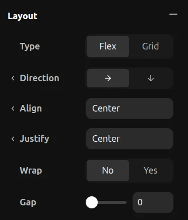
Direction
- Row — Children flow left to right
- Column — Children flow top to bottom
Justify Content
Controls alignment along the main axis (same as justify-content in CSS):
- Start — Pack items to the start
- Center — Center items
- End — Pack items to the end
- Space Between — Even space between items
- Space Around — Even space around items
Align Items
Controls alignment along the cross axis (same as align-items in CSS):
- Start — Align to start
- Center — Center items
- End — Align to end
- Stretch — Fill the available space
Gap
Set the space between children. This is the same as the CSS gap property.
Wrap
- No Wrap — All items stay on one line
- Wrap — Items flow to the next line when they overflow