Component cursors
Component cursors allow you to attach any existing component as a custom cursor. This enables fully customized cursor designs that follow the mouse pointer when hovering over an element.
To set a component cursor:
- Select an overlay element
- Expand the Cursor section in the properties toolbar
- Click Choose next to Component
- Select a component from your library to use as the cursor
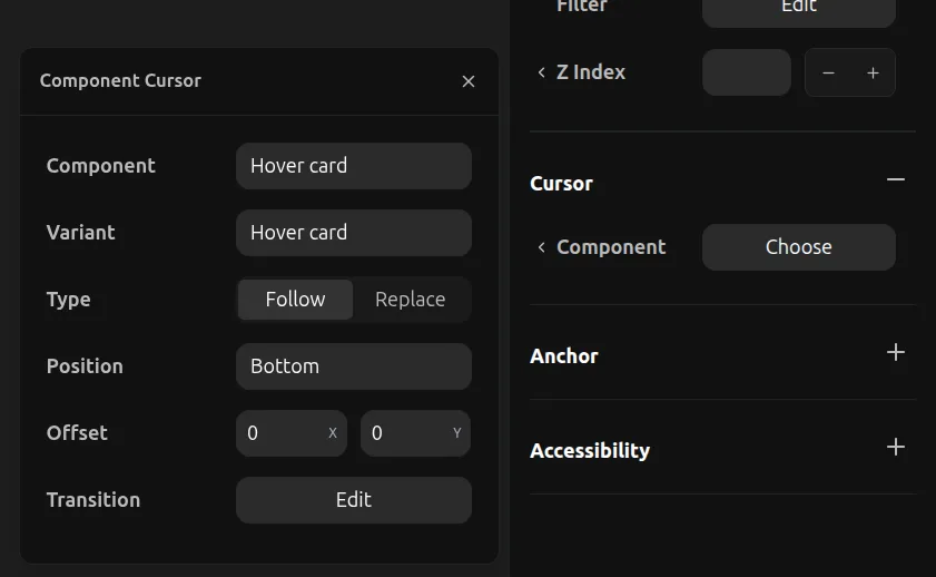
Settings
When using a component cursor, you have additional options:
- Component: The component to use as the cursor
- Variant: Which variant of the component to display
- Type: Choose between Follow (cursor follows mouse smoothly) or Replace (cursor snaps to position)
- Position: Where the cursor anchors relative to the mouse (Top, Bottom, Left, Right, Center)
- Offset: Fine-tune the cursor position with X and Y offset values
- Transition: Configure the animation transition for cursor movement