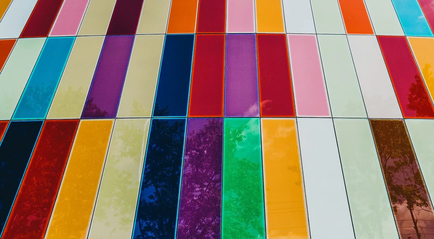
15 Website Color Palettes That Actually Work in 2026
Color sets the mood before a single word is read. It builds trust, guides attention, and creates emotional connection with your visitors.
In this guide, you'll find proven color palettes that work for modern websites, complete with hex codes you can copy and use.
Why These Palettes Work
Great website color palettes share three qualities:
Contrast — Colors are distinct enough to guide attention and ensure readability.
Purpose — Every color has a job: background, text, accent, or interactive elements.
Restraint — Using 3-5 colors keeps designs clean and intentional.
Popular SaaS Color Palettes
These color combinations are trending in modern web design. They're not tied to any specific brand—they're just proven to work.
1. Ocean Blues
Ocean Blues
Serene blue-green tones. Trustworthy, calm, professional.
Teal
Aqua
Ice Blue
Peach
Coral
Why it works: Blue-greens balance nature with technology—organic but modern. The warm peach accent prevents it from feeling cold.
Best for: Health tech, environmental brands, wellness apps, productivity tools
2. Deep Purple
Deep Purple
Rich purples with subtle accents. Luxurious, innovative, distinctive.
Deep Purple
Magenta
Lavender
Dark
Light
Why it works: Purple signals innovation and premium quality. The depth prevents it from feeling childish or playful.
Best for: Premium SaaS, creative tools, AI products, beauty brands
3. Sunset Gradient
Sunset Gradient
Warm gradient palette. Energetic, modern, eye-catching.
Orange
Amber
Yellow
Black
White
Why it works: Gradient flows feel dynamic and contemporary. Black base keeps it from feeling overwhelming.
Best for: Fitness apps, event platforms, creative agencies, marketing tools
4. Midnight Blue
Midnight Blue
Dark blue foundation with vibrant accent. Professional and trustworthy.
Midnight
Royal Blue
Blue
Light
White
Why it works: Dark blues create authority without feeling cold. The gradient of blues adds depth and sophistication.
Best for: Financial services, enterprise SaaS, security products, legal tech
5. Mint Fresh
Mint Fresh
Fresh green with cool undertones. Modern, clean, optimistic.
Mint
Forest
Light Mint
Dark Gray
Off-White
Why it works: Green signals growth and positivity. The cool tone feels technical and modern, not childish.
Best for: Finance apps, analytics platforms, growth tools, sustainability brands
6. Terracotta Warmth
Terracotta Warmth
Earthy reds and creams. Organic, grounded, approachable.
Terracotta
Clay
Cream
Brown
Off-White
Why it works: Warm tones feel human and authentic. The neutral base keeps it professional while earth tones add personality.
Best for: Wellness brands, artisan products, lifestyle apps, community platforms
7. High Contrast Pop
High Contrast Pop
Bold primaries with black. Maximum impact and clarity.
Black
Red
Blue
Yellow
White
Why it works: High contrast commands attention. Primary colors feel confident and direct—no subtlety needed.
Best for: Bold brands, youth-focused products, entertainment, sports apps
8. Slate Minimalism
Slate Minimalism
Refined grayscale with single accent. Clean, focused, timeless.
Slate 900
Slate 700
Slate 500
Slate 50
Indigo Accent
Why it works: Near-monochrome keeps focus on content. Single accent color draws attention exactly where needed.
Best for: Documentation sites, technical tools, minimalist SaaS, note-taking apps
Popular Palettes from Real Websites
These are the actual color palettes used by successful modern websites. They're proven to work at scale.
Stripe
Stripe
High contrast with a vibrant accent. Clean, professional, trustworthy.
Downriver
Blue Ribbon
Cyan
Background
White
Why it works: Deep navy creates authority without feeling cold. The bright purple accent feels modern and energetic. Perfect for fintech where trust matters.
Used for: Payment processing, financial infrastructure, developer tools
Vercel
Vercel
Stark black and white with strategic blue accent. Ultra-modern minimalism.
Black
Blue
Gray 900
Gray 50
White
Why it works: Maximum contrast creates clarity. The pure black-and-white base lets content breathe, while blue accents draw attention to CTAs.
Used for: Deployment platform, developer tools, hosting services
Linear
Linear
Soft indigo with neutral grays. Calm, focused, sophisticated.
Indigo
Slate
Gray
Background
White
Why it works: Muted indigo feels premium without being aggressive. The neutral palette keeps focus on content while still feeling distinctive.
Used for: Issue tracking, project management, team collaboration
Spotify
Spotify
Bold green on black. Instantly recognizable, high energy.
Spotify Green
Black
Dark Gray
White
Gray
Why it works: The electric green pops against pure black, creating energy and excitement. Simple but impossible to forget.
Used for: Music streaming, audio platforms, entertainment
Figma
Figma
Playful multi-color system. Friendly, creative, approachable.
Red
Coral
Purple
Blue
Green
Why it works: Multiple bright colors signal creativity and flexibility. Each color serves as a category marker, making the interface intuitive.
Used for: Design tools, collaboration platforms, creative software
Airbnb
Airbnb
Warm coral with supporting pastels. Welcoming and human.
Rausch
Babu
Pumpkin
Hof
Foggy
Why it works: Coral is warm and inviting without being overwhelming. The supporting colors add personality while maintaining professionalism.
Used for: Travel marketplace, hospitality, booking platforms
Shopify
Shopify
Fresh green palette. Growth-oriented and optimistic.
Green
Dark Green
Lime
Black
White
Why it works: Green symbolizes growth and money—perfect for e-commerce. The natural shade feels accessible, not corporate.
Used for: E-commerce platforms, online stores, merchant tools
GitHub
GitHub
Developer-focused with functional color coding.
Dark
Blue
Green
Red
White
Why it works: Colors have functional meaning (green = success, red = errors). Clean and straightforward for technical users.
Used for: Code hosting, developer collaboration, version control
Notion
Notion
Pure black and white minimalism. Content takes center stage.
Black
Dark Gray
Gray
Background
White
Why it works: Zero color distractions. The subtle warmth in the off-black and off-white prevents it from feeling sterile.
Used for: Note-taking, documentation, knowledge management
Medium
Medium
Classic black, white, and green for focus and readability.
Black
Green
Gray
Light Gray
White
Why it works: Prioritizes reading experience. The green accent is just enough personality without competing with content.
Used for: Publishing platform, blogs, long-form content
Choosing Your Palette
Here's how to pick colors that work for your site:
Start with Purpose
Ask what feeling you want to create:
- Trust and calm → Blues, teals, soft neutrals
- Energy and action → Reds, oranges, bright greens
- Premium and sophisticated → Deep purples, blacks, golds
- Friendly and approachable → Warm corals, soft greens, earth tones
Test for Accessibility
Your colors must have sufficient contrast for readability:
- Body text needs at least 4.5:1 contrast ratio
- Large text (18pt+) needs at least 3:1
- Interactive elements should be clearly distinguishable
Use tools like WebAIM's contrast checker to verify your choices.
Keep It Simple
Most successful sites use:
- 1 primary color for brand identity
- 1-2 accent colors for CTAs and highlights
- Grayscale palette for text, backgrounds, borders
More colors = more decisions = more complexity. Start minimal.
Consider Your Content
If you have:
- Lots of images → Neutral palette lets photos shine
- Heavy text → High contrast with plenty of white space
- Complex UI → Functional colors for states (success, error, warning)
- Minimal content → Bold colors can add personality
Test in Context
Colors behave differently:
- On different screen brightnesses
- Next to other colors
- At different sizes
- With your actual content
Build a quick prototype to see how your palette actually feels in use.
Color Trends for 2026
The web is moving toward:
More blue-greens — Balancing technology with nature, these teal shades feel fresh and trustworthy.
Deeper, richer blacks — Pure black (#000) is giving way to near-blacks with subtle warmth (#0A0A0A, #1A1A1A).
Earthy neutrals — Beiges, taupes, and warm grays replace stark whites for a softer feel.
Intentional restraint — Fewer colors, more purposeful. Every color earns its place.
Final Thoughts
Your color palette is one of the first things visitors notice. It sets expectations, creates mood, and guides behavior.
The best palettes aren't about following trends—they're about matching colors to your purpose, content, and audience.
Start with these examples, adapt them to your needs, and test with real content. The right palette will feel obvious once you find it.
Revyme