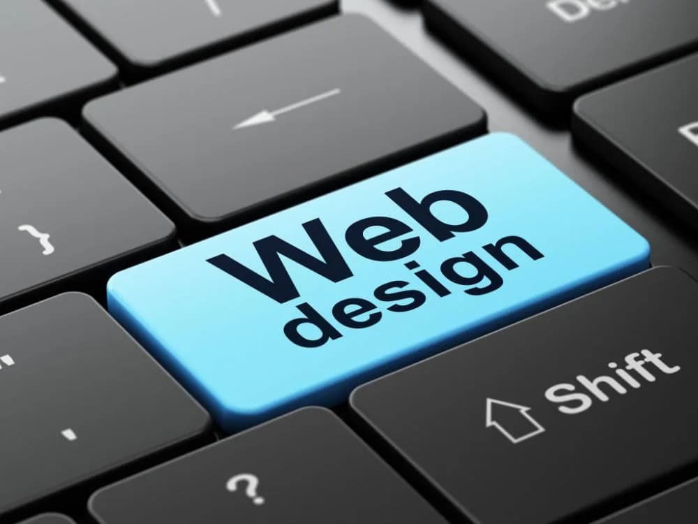
The Evolution of Web Design: GeoCities to Modern Web
Web design has transformed from blinking text and tiled backgrounds to the sophisticated, responsive interfaces we use today. This evolution tells the story of technology, culture, and how we communicate online.
Let's travel through each era, examining the design trends, technologies, and iconic websites that defined them.
1991-1995: The Beginning
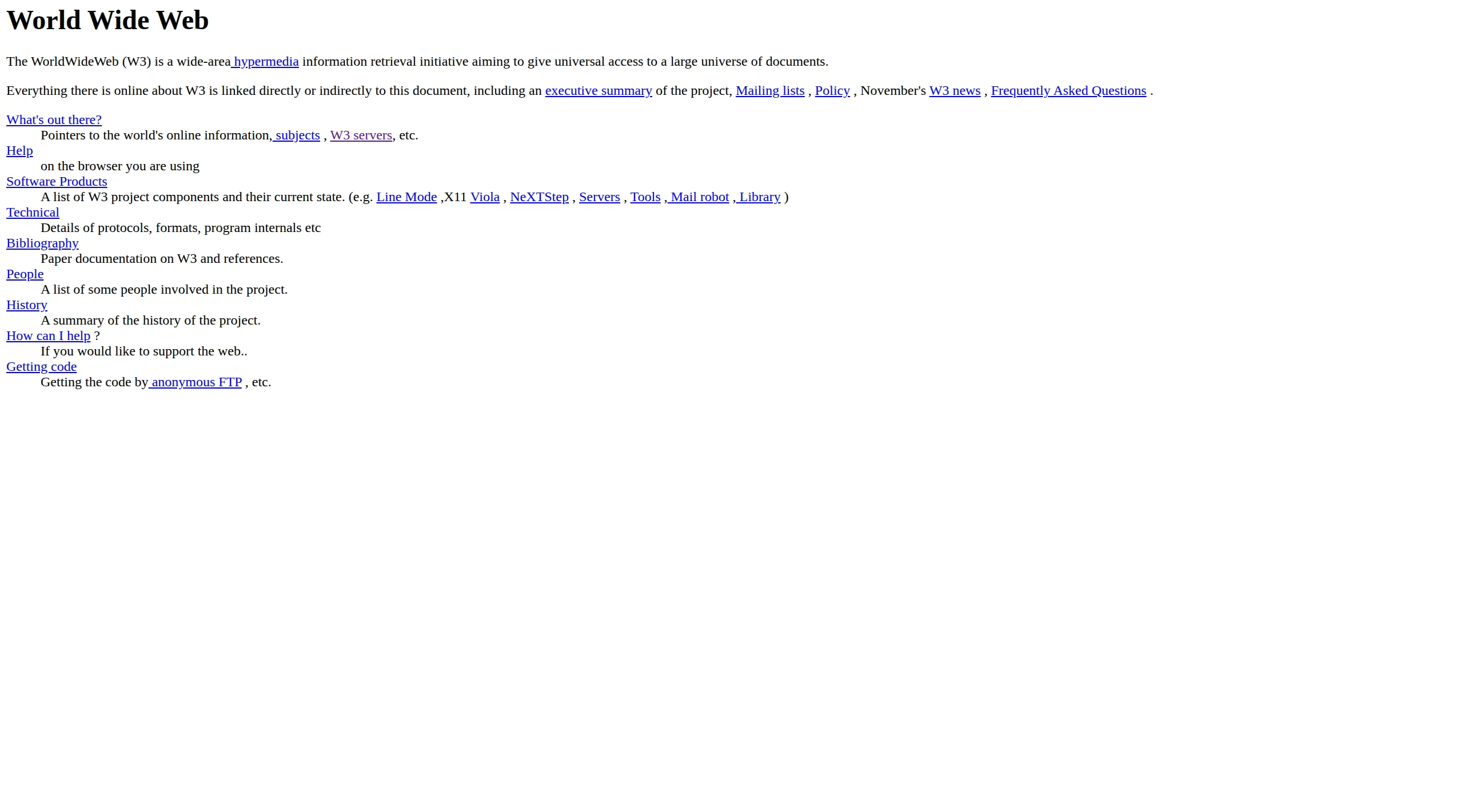
The First Webpage
On August 6, 1991, Tim Berners-Lee published the first webpage at CERN. It was pure HTML—black text on a gray background, blue hyperlinks, no images, no styling.
What it looked like:
- Plain text documents
- Blue underlined links
- No layout control
- Monospace fonts
- Single column content
Technology:
- HTML only (no CSS, no JavaScript)
- Text-based browsers
- Dial-up connections
- 640×480 screen resolution
The web wasn't designed to look good. It was designed to share information between scientists. Aesthetics weren't even a consideration.
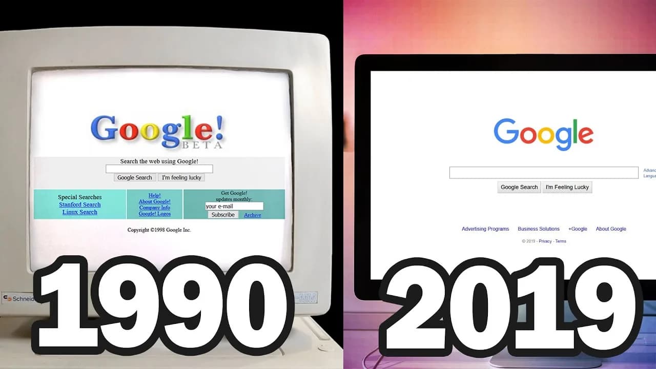
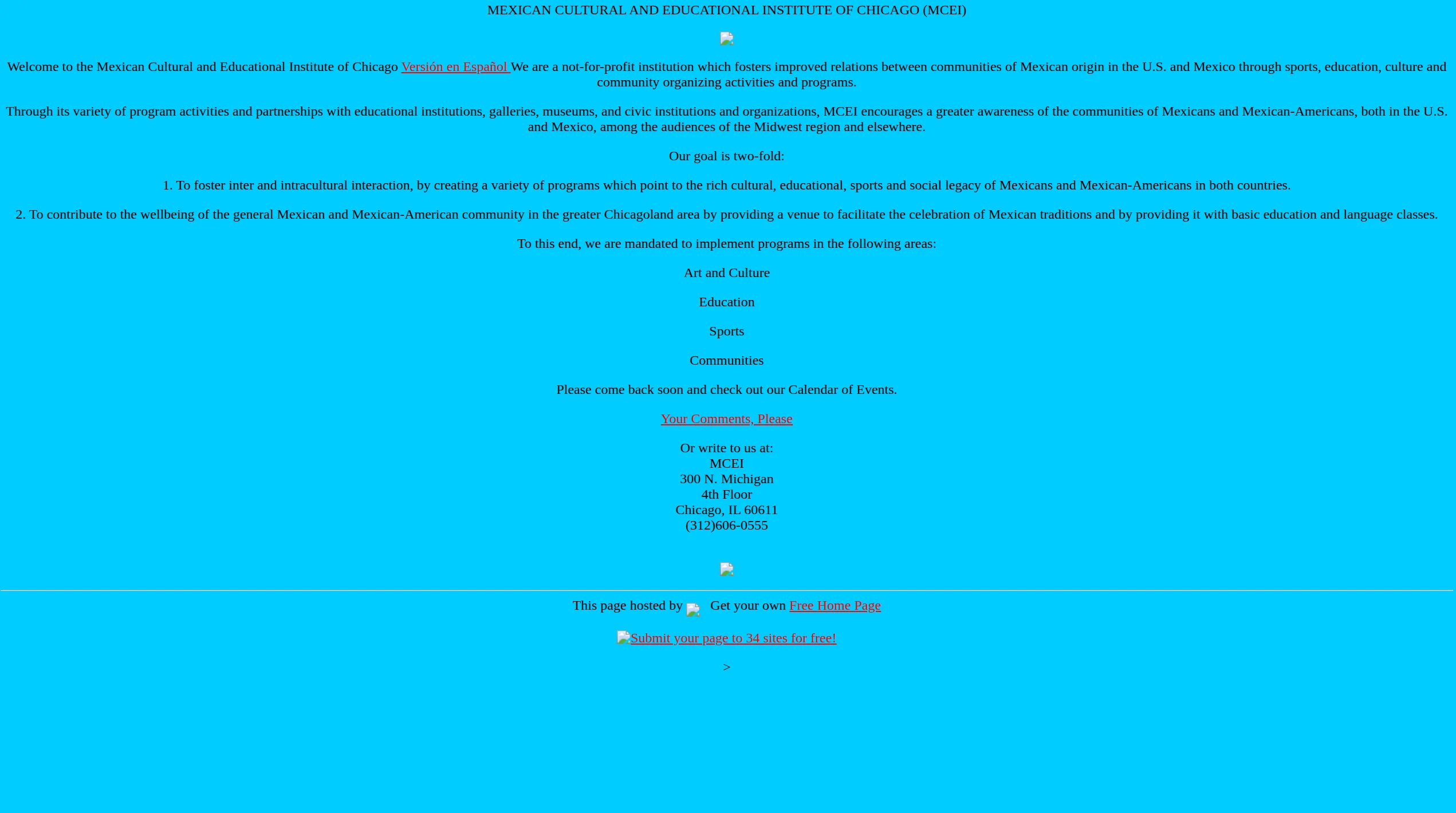
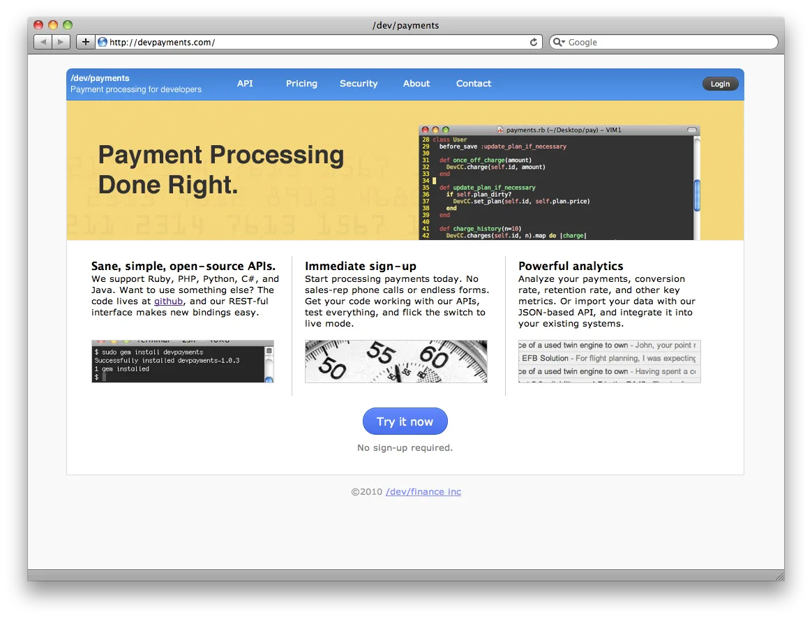
1995-1999: The Wild West
GeoCities, Angelfire & Personal Homepages
In 1994, Netscape Navigator launched with <img> tags, tables for layout, and support for background colors. Suddenly, the web could be designed.
By 1996, GeoCities hosted millions of personal homepages. Anyone could build a website, and they did—with no rules, no standards, no restraint.
Defining characteristics:
Tiled backgrounds — Small repeating images (starfields, marble textures, construction signs) covered entire pages, often making text impossible to read.
Animated GIFs — Spinning logos, dancing babies, flames, and "under construction" signs moved constantly. Every page had dozens.
Hit counters — Displayed at the bottom: "You are visitor #000047!" Sites competed for traffic.
Frames — Split browser into multiple sections, each with its own scrollbar. Navigation on left, content on right, banner on top.
<marquee> and <blink> tags — Text scrolled horizontally or flashed on/off. Both were annoying. Both were everywhere.
Guestbooks — Visitors signed their name, left a message. Like comments, but harder.
MIDI background music — Auto-playing, couldn't be stopped, different on every page.
"Best viewed in..." — Sites often only worked in Netscape or Internet Explorer, not both.
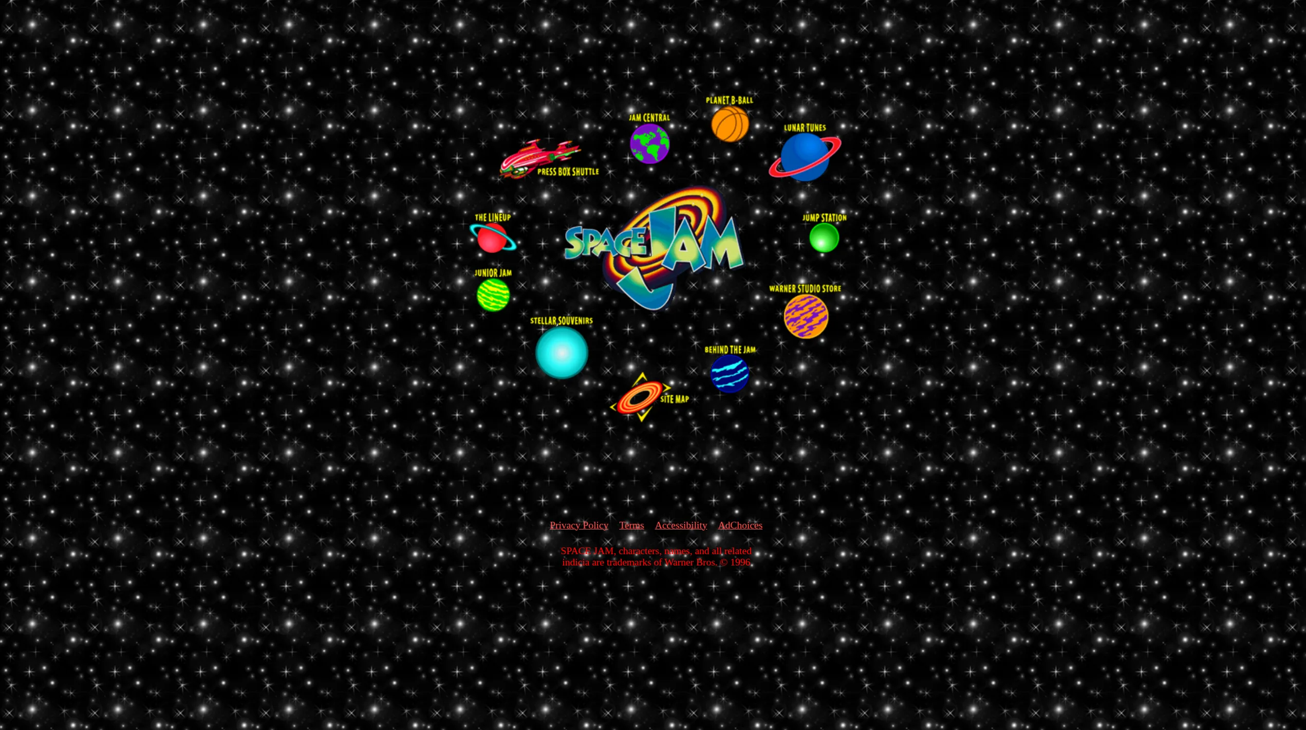
Iconic example: Space Jam (1996)
The promotional site for the movie Space Jam launched in 1996 and still exists unchanged at spacejam.com/1996/.
It features everything quintessentially '90s:
- Tiled starfield background
- Image map navigation (clickable image sections)
- Low-resolution graphics
- Frames-based layout
- No responsive design (wasn't a concept yet)
The site is a time capsule, perfectly preserved.
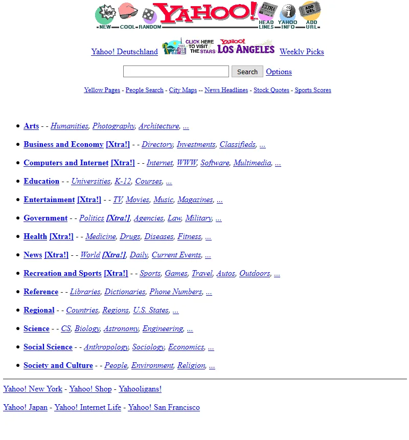
Yahoo (1996)
Yahoo in 1996 was a simple directory—a list of blue hyperlinks organized by category, with a basic search bar. No styling, just function. It looked like a phone book.
2000-2005: The CSS Revolution
Web Standards & The Dot-Com Crash
The dot-com bubble burst in 2000-2001, and with it, the excess of '90s web design. The web got serious.
CSS (Cascading Style Sheets) became widely supported, allowing separation of content (HTML) and presentation (CSS). This was revolutionary.
What changed:
Fixed-width layouts — Most sites designed for 800×600 or 1024×768 screens, centered with fixed pixel widths.
Navigation bars — Consistent top or left navigation replaced random link placement.
Cleaner aesthetics — Fewer animated GIFs, more intentional color schemes.
Drop shadows and gradients — CSS allowed subtle depth effects, used everywhere.
Flash — Interactive animations, intro sequences, entire sites built in Flash. Beautiful but inaccessible and terrible for SEO.
Rounded corners — Achieved through image sprites (4 corner images positioned carefully). Creating rounded corners took 20 minutes.
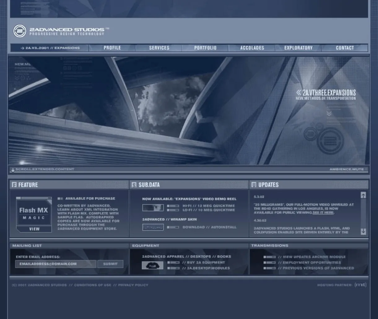
Web 2.0 Aesthetics (2004-2009)
The term "Web 2.0" described a shift from static pages to interactive platforms (blogs, social networks, user-generated content).
Design reflected this:
Glossy buttons — Shiny, 3D-looking buttons with highlights and gradients.
Reflections — Everything reflected on a glossy surface below it.
Large rounded corners — Softer, friendlier feel than sharp edges.
Centered layouts with whitespace — Content in center column, generous margins.
Badges and stickers — "Beta" badges, social media icons, award graphics.
Web 2.0 color palette — Bright blues, oranges, greens. High saturation.
Iconic sites of this era:
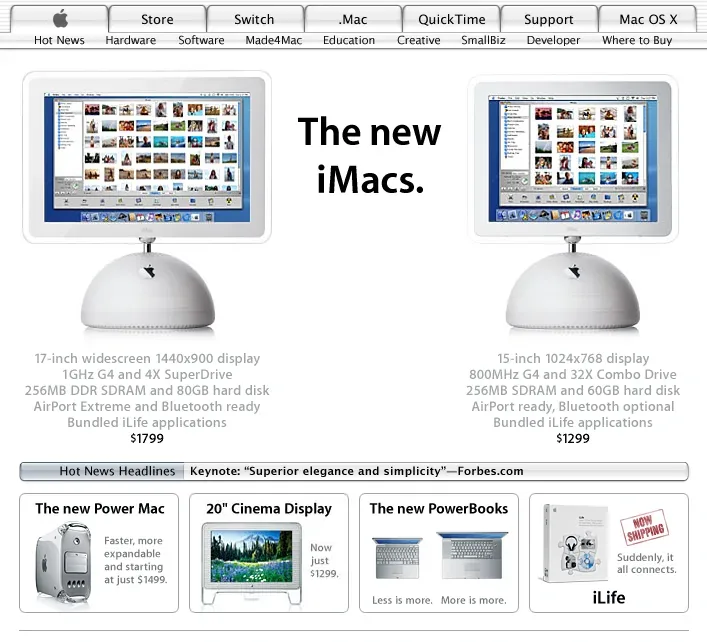
Apple.com (2003-2006) — Clean white backgrounds, large product photos, minimal navigation. Set the standard for product websites.
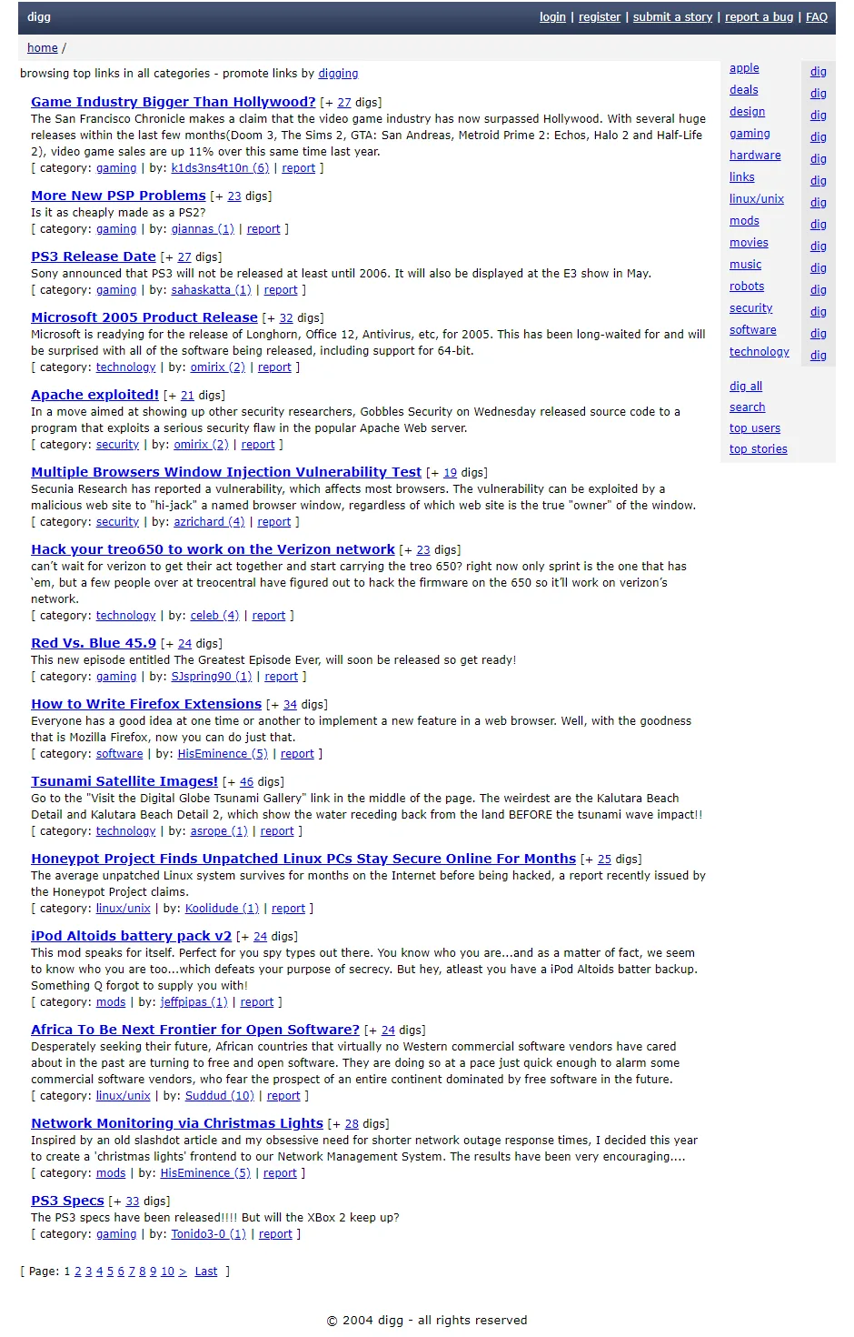
Digg (2004) — Orange and blue color scheme, rounded corners, glossy buttons. Quintessential Web 2.0.
Twitter (2006) — Simple blue bird logo, clean interface, focus on content.
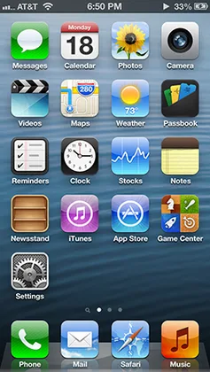
2007-2012: Skeuomorphism
The iPhone Era
When Apple released the iPhone in 2007, it changed everything. Suddenly, websites needed to work on touchscreens.
But first came skeuomorphism—design that mimics real-world objects.
What skeuomorphism looked like:
Apple's iOS 6 (2012) was peak skeuomorphism:
- Notes app — Yellow legal pad with leather stitching at top
- Calendar — Looked like physical calendar with torn paper edges
- Contacts — Leather-bound address book
- Compass — Realistic 3D compass with shadows
- Voice Memos — Vintage microphone on wood table
- Podcasts — Reel-to-reel tape player interface
- iBooks — Wooden bookshelf
Every app mimicked a physical object. Textures everywhere—leather, wood, metal, felt, stitching.
Why it worked (initially):
- Made new technology familiar
- Helped users understand function (notepad = write notes)
- Showcased screen quality (Retina display)
- Felt premium and crafted
Why it stopped working:
- Users understood digital interfaces—metaphors unnecessary
- Heavy textures distracted from content
- Harder to maintain consistency
- Felt dated as flat design emerged
Web skeuomorphism:
Websites adopted similar aesthetics:
- Textured backgrounds (wood, leather, fabric)
- 3D buttons with depth
- Realistic shadows
- Stitching and embossing effects
- Interface elements that looked physical
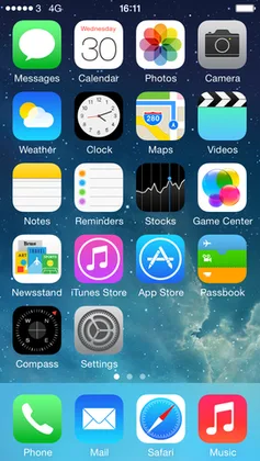
2012-2016: Flat Design Revolution
iOS 7 & The Flat Design Shift
In 2013, Apple released iOS 7. Overnight, skeuomorphism died.
Jony Ive's flat design:
- Removed all textures
- Flat, solid colors
- Thin typography (Helvetica Neue Ultra Light)
- Minimal shadows
- Simplified icons
- Translucency and blur instead of depth
The contrast with iOS 6 was shocking. The industry followed immediately.
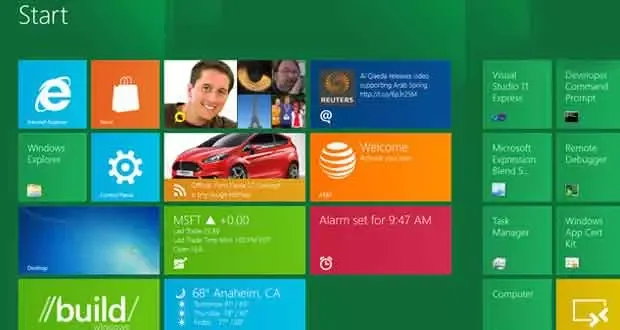
Microsoft was first — Windows Phone 7 (2010) and Windows 8 (2012) pioneered "Metro" design with flat tiles, bold typography, and solid colors before Apple.
Google followed — But took a different approach...
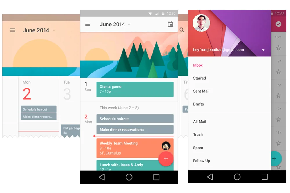
Material Design (2014)
Google introduced Material Design as an answer to flat design's limitations.
Key principles:
Physical metaphors — UI elements behave like paper and ink, not skeuomorphic objects.
Elevation and shadows — Z-axis depth through shadows. Everything exists on layers.
Motion with meaning — Animations show spatial relationships.
Bold color — Bright, saturated primary colors with intentional accent colors.
Grid-based layouts — Everything aligns to 8dp grid.
Material Design was "Flat 2.0" — Added back depth through shadows and layering, without textures.
Flat Design Characteristics:
Simple, geometric shapes — Circles, squares, clean icons
Bright, bold colors — Primary colors, high contrast
Whitespace — Generous spacing, breathing room
Sans-serif typography — Helvetica, Roboto, Open Sans
No gradients (initially) — Pure flat colors only
Ghost buttons — Outlined buttons with no fill
Card-based layouts — Content in rectangular cards
Iconic flat design sites:
Stripe (2014-present) — Clean flat colors, simple shapes, clear typography
Medium (2012-present) — Extreme minimalism, focus on reading
Airbnb redesign (2014) — Flat color scheme, clean sans-serif, whitespace
2016-2020: Maturation & Experimentation
The Refinement Period
By 2016, flat design was everywhere. The question became: what's next?
Trends that emerged:
Gradients Return
After years of pure flat colors, gradients came back—but different:
Modern gradients:
- Soft, subtle transitions
- Duotone effects
- Purple/pink/blue combinations
- Used as accents, not everywhere
- Often combined with transparency
Instagram's 2016 rebrand brought gradients back into mainstream with their purple-orange-pink gradient icon.
Illustrations & Custom Graphics
Stock photos gave way to custom illustrations:
- Flat, geometric character illustrations
- Bright, cheerful color palettes
- Diverse representation
- Unique brand personality
Companies like Slack, Mailchimp, and Dropbox built distinctive visual identities through illustration.
Asymmetric Layouts
Breaking the grid became intentional:
- Overlapping elements
- Diagonal layouts
- Text over images
- Broken grid systems
- More dynamic, less predictable
Dark Mode
As OLED screens became common, dark mode emerged:
- Reduces eye strain
- Saves battery on mobile
- Looks modern and premium
- Many apps/sites offered toggle
Micro-interactions
Small animations that respond to user input:
- Button hover states
- Loading animations
- Pull-to-refresh
- Swipe gestures
- Haptic feedback
Brutalism & Anti-Design
A small movement rejected polish entirely:
- Raw, unfinished aesthetics
- Intentional "broken" layouts
- Monospace fonts
- Harsh colors
- No whitespace
- Websites as art, not function
2020-Present: Modern Web
Today's Design Landscape
Modern web design is pluralistic—no single dominant style. Instead, multiple trends coexist:
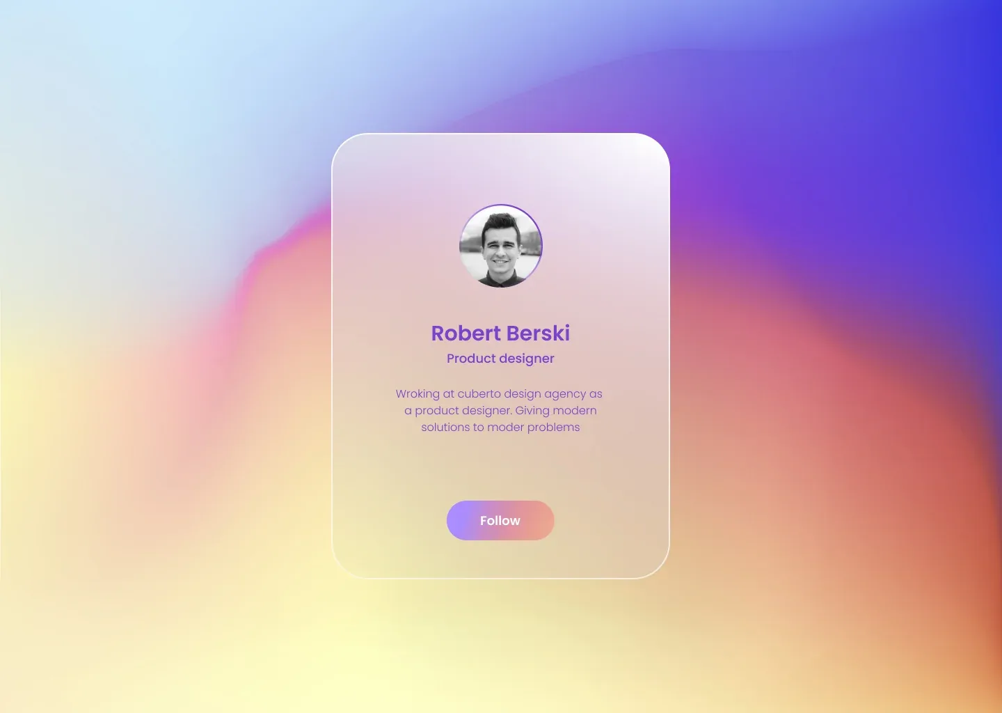
Glassmorphism
Frosted glass effects:
- Blurred transparent backgrounds
- Subtle borders
- Layered depth
- Soft shadows
- Apple-inspired aesthetic
Popularized by Apple's Big Sur (2020) and Windows 11 (2021).
Neumorphism (Brief Trend)
Soft, extruded UI elements:
- Single-color backgrounds
- Soft shadows (light and dark)
- Subtle depth
- Minimal contrast
Problem: Poor accessibility, hard to see interactive elements. Quickly faded.
Bold Typography
Text as design element:
- Massive headlines
- Mixed font sizes
- Custom fonts
- Text as hero image
- Kinetic typography
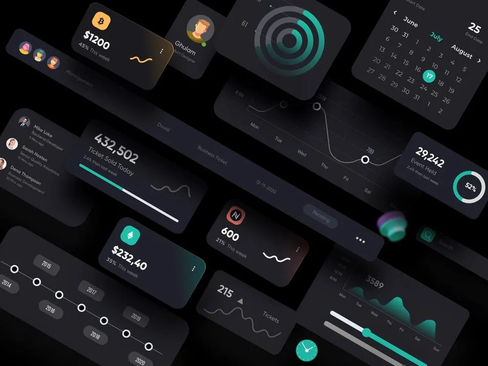
3D Elements & Depth
- Real 3D graphics (WebGL, Three.js)
- Isometric illustrations
- Shadows and layering
- Parallax scrolling
- Scroll-triggered animations
Maximalism Returns
After years of minimalism, some sites embrace:
- Bright, clashing colors
- Layered graphics
- Dense information
- Nostalgic Y2K aesthetics
- Intentional complexity
Variable Fonts & Advanced Typography
- Fluid font sizes
- Responsive typography
- Animation-ready fonts
- Better rendering

Key Takeaways
The Pattern
Web design history follows a cycle:
- New technology enables new design
- Designers go overboard (more is more)
- Market matures (simplification)
- Minimalism becomes boring
- Experimentation returns
- Repeat
We saw this in:
- '90s excess → 2000s clean → gradients → flat → gradients return
- Skeuomorphism → flat design → depth returns (shadows, layers)
- Minimalism → maximalism → minimalism
Technology Drives Design
Every major shift coincided with technology:
- CSS (2000s) → layouts and styling
- iPhone (2007) → mobile design, touch interfaces
- Responsive design (2010) → fluid layouts
- High-DPI screens (2012) → icon fonts, SVG
- WebGL (2015+) → 3D graphics
- Dark mode (2019) → system-aware design
Accessibility Gains
Modern design prioritizes:
- Color contrast
- Keyboard navigation
- Screen reader support
- Reduced motion options
- Semantic HTML
This is new. Early web design didn't consider accessibility at all.
What's Next?
Current trends suggest:
- AI-generated content will need new UI patterns
- Spatial computing (Vision Pro) will change interfaces entirely
- Personalization at scale (layouts adapt to users)
- Performance as design constraint
- Sustainability (lighter sites, less power consumption)
Resources for Exploration
Want to see these designs yourself?
Web Design Museum — 1,600+ screenshots from 1995-2006, searchable by year and style
Cameron's World — Beautiful archive of GeoCities GIFs and websites
Internet Archive's Wayback Machine — Browse any site's history
Version Museum — Visual history of major websites
Space Jam (1996) — The original, still live
Final Thoughts
Web design isn't just about trends. It's about solving problems for users with the technology available at the time.
The '90s chaos came from excitement—anyone could build a website. The 2000s clean-up came from professionalization. Skeuomorphism made touch interfaces learnable. Flat design removed distraction. Modern design embraces plurality.
Each era made sense for its time. And today's "obviously correct" design choices will look dated in 10 years.
That's the fun of it.
The web keeps evolving, and design evolves with it.
Revyme