9 Modern Website Navigation Patterns That Actually Work
Your navigation menu is the map to your entire website. Get it right, and visitors find what they need in seconds. Get it wrong, and they leave.
This guide breaks down 9 navigation patterns used by modern websites, with real examples and principles for choosing the right approach.
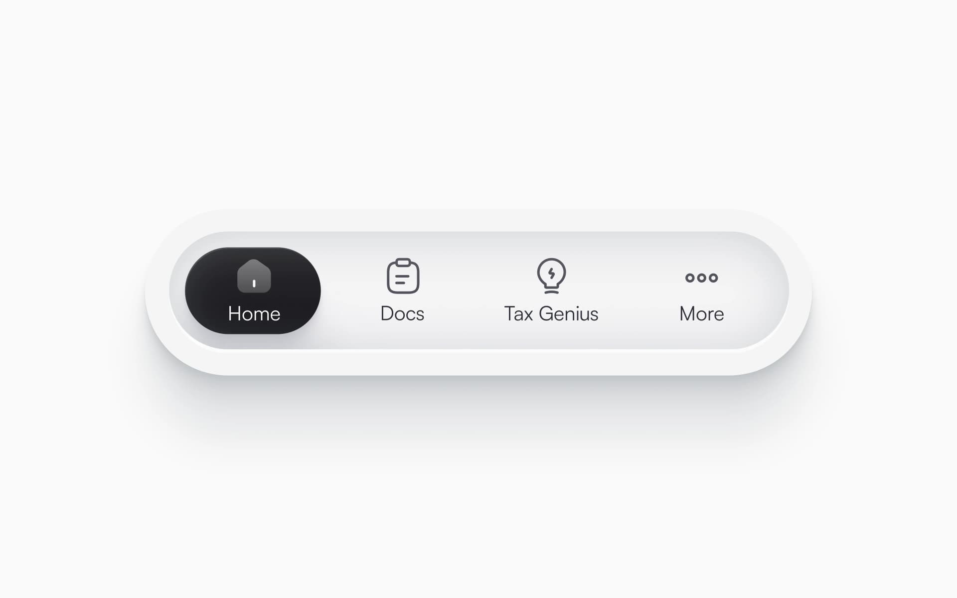
1. Minimal Horizontal Nav
What it is: A clean top bar with 3-5 main links. No dropdowns, no clutter.
Real examples:
- Linear — Product, Features, Method, Customers, Changelog
- Vercel — Home, Templates, Docs, Enterprise, Pricing
- Notion — Product, Download, Solutions, Resources, Pricing
Why it works:
- Forces priority. You can only show what truly matters.
- Fast to scan. Users see all options instantly.
- Mobile-friendly. Fewer items = easier responsive design.
Best for:
- Simple products with clear value props
- Early-stage companies
- Content-focused sites
When to avoid:
- Complex product suites with multiple audiences
- Sites with deep content hierarchies
- E-commerce with large catalogs
2. Dropdown Navigation
What it is: Top-level categories that reveal subcategories on hover or click.
Real examples:
- Stripe — Products dropdown shows Payments, Billing, Connect in organized columns
- Apple — Each product category expands to show models and accessories
- Figma — Products, Enterprise, Resources expand with organized sections
Why it works:
- Hides complexity. Surface looks simple, depth is there when needed.
- Organized categories help users navigate large sites.
- Keeps top bar clean while offering access to everything.
Best for:
- Multi-product companies
- Service businesses with different offerings
- Sites with 10-30+ pages
Design tips:
- Limit dropdowns to 2-3 levels deep
- Group related items with clear headings
- Show dropdown on hover (desktop) but require click (mobile)
- Add visual separation between groups
3. Mega Menu
What it is: Full-width dropdown panels with multiple columns, images, and CTAs.
Real examples:
- Shopify — Solutions mega menu shows industry-specific options with icons
- Patagonia — Product categories with imagery and featured collections
- GitHub — Product dropdown with descriptions, visuals, and quick links
Why it works:
- Handles massive site architecture elegantly.
- Visual aids (icons, images) help users navigate faster.
- Can include CTAs, featured content, and promotional areas.
Best for:
- E-commerce with extensive catalogs
- Enterprise software with multiple products
- Content sites with diverse sections
Design tips:
- Use images sparingly — too many create decision paralysis
- Organize with clear column headers
- Include "View All" links for each section
- Keep mega menus under 800px height to avoid scrolling
4. Sidebar Navigation
What it is: Vertical menu on the left (or right) side of the screen.
Real examples:
- Notion (app) — Workspace sidebar with nested pages and favorites
- Medium — Left sidebar with personalized content and topics
- Amazon — Product category sidebar on shop pages
Why it works:
- More vertical space = more navigation items visible.
- Great for hierarchical content (docs, apps, dashboards).
- Persistent navigation keeps context while content changes.
Best for:
- Documentation sites
- Web applications and dashboards
- Content platforms with deep nesting
Design tips:
- Place on left side (eye-tracking shows better engagement)
- Make collapsible to save screen space
- Highlight current page/section
- Limit width to 200-300px
5. Hamburger Menu
What it is: Icon (three horizontal lines) that opens a hidden menu panel.
Real examples:
- Mobile versions of almost every site
- Medium — Desktop hamburger reveals personalized content
- Spotify Web — Main navigation hidden behind hamburger
Why it works:
- Saves screen space, especially on mobile.
- Allows for lengthy nav lists without cluttering interface.
- Familiar pattern users understand instantly.
Best for:
- Mobile-first sites
- Apps with complex navigation
- Sites prioritizing visual content over navigation
Controversy: Hamburger menus hide navigation, which can reduce discoverability. Test if conversion drops when hiding nav behind a hamburger.
Design tips:
- Animate smoothly (slide-in feels better than fade-in)
- Include close button in obvious position
- Consider showing key links outside hamburger
- On desktop, only use if you have strong reason to hide nav
6. Centered Logo with Split Nav
What it is: Logo in the center with navigation items split to left and right.
Real examples:
- Luxury fashion brands — Logo center stage, shop left, about right
- Restaurants — Menu and location on left, reservations on right
- Portfolios — Work on left, logo center, about/contact right
Why it works:
- Brand-forward. Logo gets most prominent position.
- Creates visual balance and symmetry.
- Separates action items (right) from browsing items (left).
Best for:
- Brand-focused businesses
- Sites with strong visual identity
- Restaurants, fashion, creative studios
Design tips:
- Keep it simple (3-4 items per side maximum)
- Put CTAs on the right (where eyes land after scanning)
- Make sure logo doesn't dominate on mobile
7. Sticky Navigation
What it is: Nav bar that stays fixed at top while scrolling.
Real examples:
- Stripe — Nav remains accessible throughout long landing pages
- Apple — Sticky nav with transparent background that fills on scroll
- Framer — Compact sticky nav on product pages
Why it works:
- Navigation always accessible, no scrolling back to top.
- Increases engagement with secondary pages.
- Can show different content (mini cart, progress indicator) as users scroll.
Best for:
- Long-form content sites
- E-commerce (keeps cart accessible)
- Multi-page flows (checkout, onboarding)
Design tips:
- Make it compact (50-60px height max)
- Change background opacity on scroll for visual interest
- Hide on scroll down, show on scroll up (better than always-visible)
- Test performance — sticky navs can feel janky if not optimized
8. Footer Navigation
What it is: Comprehensive link collection at bottom of page.
Real examples:
- GitHub — Product, Platform, Company, Support columns
- Spotify — Company, Communities, Useful Links sections
- Notion — Product, Use Cases, Resources, Company
Why it works:
- Catches users who scrolled to bottom without converting.
- Doesn't compete with main nav for attention.
- Room for comprehensive links (legal, social, sitemap).
Best for:
- Every website (seriously, everyone should have one)
- Sites with complex architecture
- Additional links that don't warrant main nav space
Design tips:
- Organize into 3-5 clear columns
- Include newsletter signup or value prop
- Add social links and contact info
- Keep consistent across all pages
9. No Navigation
What it is: Landing pages with zero traditional navigation. Just content and CTAs.
Real examples:
- Campaign landing pages — Focused on single conversion goal
- Product launches — Tell story from top to bottom
- Event registrations — Minimize distraction from signup
Why it works:
- Removes exit points. Users stay on conversion path.
- Forces sequential story-telling.
- Tests show higher conversion for single-purpose pages.
Best for:
- Campaign landing pages
- Product waitlists
- Event registrations
- High-value conversion pages
Design tips:
- Include small logo linking to main site (transparency)
- Use clear sections to guide users down page
- Strong CTAs at multiple points
- Consider legal links in footer even with no nav
Choosing Your Navigation Pattern
Match your navigation to your site's purpose:
If you have...
<5 pages → Minimal horizontal nav Simple and fast. Show everything.
10-30 pages → Dropdown navigation Organized hierarchy without overwhelming users.
30-100+ pages → Mega menu or sidebar Need visual organization or persistent navigation.
Product with dashboard/app → Sidebar Persistent context while users navigate features.
Single conversion goal → No navigation Remove distractions, increase focus.
Consider your audience
Consumer audience → Favor simplicity and recognition Use familiar patterns (dropdowns, hamburger menus).
Technical audience → More complexity is okay Developers and power users can handle dense navigation.
Mobile-heavy traffic → Mobile-first patterns Test hamburger menu, bottom nav, or minimal horizontal.
Navigation Design Principles
No matter which pattern you choose, these principles always apply:
1. Keep it under 7 items
Human short-term memory holds 5-7 items. More than that overwhelms users and slows decisions.
If you have more, group them into categories.
2. Order by priority, not alphabet
Put most important items first (left on horizontal nav, top on vertical).
Alphabetical ordering is for indexes, not navigation.
3. Make the current page obvious
Highlight active page with underline, bold, or different color.
Users should always know where they are.
4. Test on real devices
Navigation behaves differently on phones, tablets, desktops.
Test tap targets (44px minimum), hover states, and scrolling behavior.
5. Provide search for complex sites
Once you have 50+ pages, search becomes necessary.
Make search prominent — top-right is standard.
6. Keep consistent across pages
Navigation should look and behave the same everywhere.
Consistency builds familiarity and confidence.
Mobile Navigation Considerations
Navigation patterns that work on desktop often fail on mobile:
Horizontal nav → Prioritize or collapse Show 3 key items, hide rest in hamburger.
Dropdowns → Require tap, not hover Hover doesn't exist on touch devices.
Mega menus → Simplify or remove Full mega menus rarely work on small screens.
Sticky nav → Make compact Mobile screen space is precious.
Bottom navigation → Consider for apps Thumb-friendly zone for core actions.
Testing Your Navigation
Numbers don't lie. Track these metrics to see if your navigation works:
- Bounce rate — Do visitors leave immediately? Might indicate confusing nav.
- Pages per session — Are people exploring? Good nav encourages clicking.
- Time to key pages — How long to reach product/pricing/contact? Should be under 3 clicks.
- Search queries — What are people searching for? Add those to nav.
- Mobile vs desktop behavior — Different patterns might work better for each.
Heatmap tools like Hotjar show where people actually click.
Final Thoughts
The best navigation pattern is the one that helps your visitors find what they need, fast.
Simple sites benefit from minimal navigation. Complex sites need organized structure. Single-purpose pages can skip navigation entirely.
Start with your site's purpose and user goals. Choose the pattern that removes friction from reaching those goals.
And remember: navigation exists to help users. If you're spending more time on making it clever than making it clear, you've lost the plot.

Revyme