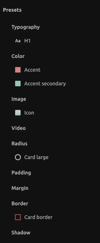
Style presets
Create reusable style presets for consistent design across your project.
Creating Presets
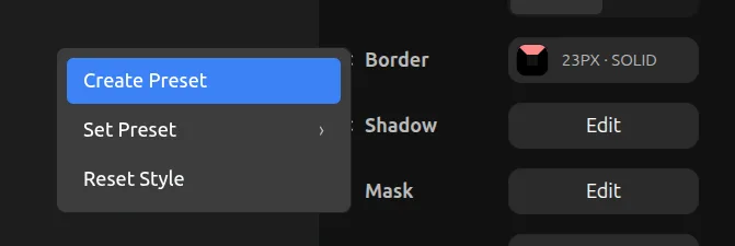
You can create presets by clicking the + button in the Library panel under the Presets section.
You can also create a preset by clicking on the style label name (for styles that support presets) and clicking on Create Preset.
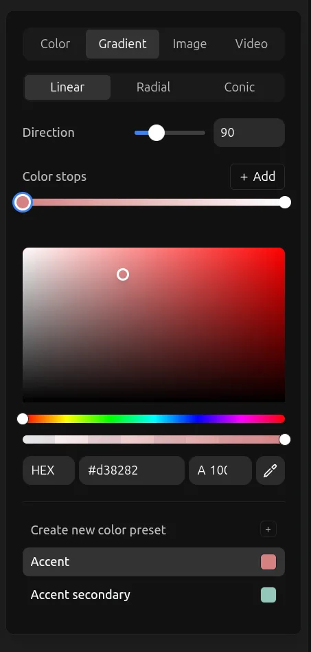
Color Presets
For color presets, you can also create directly from the Fill button by clicking Create new color preset.
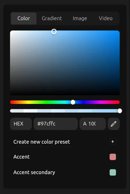
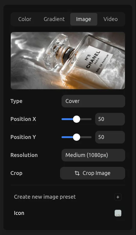
Image & Video Presets
The same mechanism works for image and video presets from the Fill button.
Gradient Presets
You can apply a color preset on individual gradient color stops.
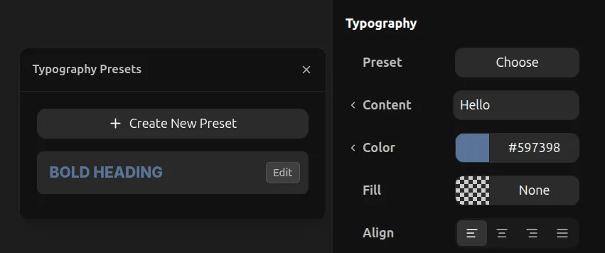
Typography Presets
Typography presets allow you to save and reuse text styles across your project.
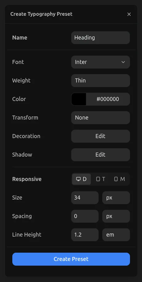
In the Responsive tab, you can set different sizes for Desktop, Tablet, and Mobile. When you apply the preset, the font size, spacing, and line height will be resolved respectively on every viewport.
When you are inside a component, the typography preset will always show the Desktop values on all variants. However, the actual font size applied depends on which viewport you place the component instance — it will use the corresponding size from the preset for that viewport.
Applying Typography Presets
To apply a typography preset, select a text element, go to the Typography tool in the right toolbar, and select the preset you want to apply.